Redesign the Handheld Terminal to Improve Workers’ Efficiency and Comfort
Project type
0→1 design innovation
My role
Product design
User research
Overview
This redesign aims to improve user comfort and operational efficiency by creating a more intuitive and affordable personal digital assistant (PDA) for logistics workers.
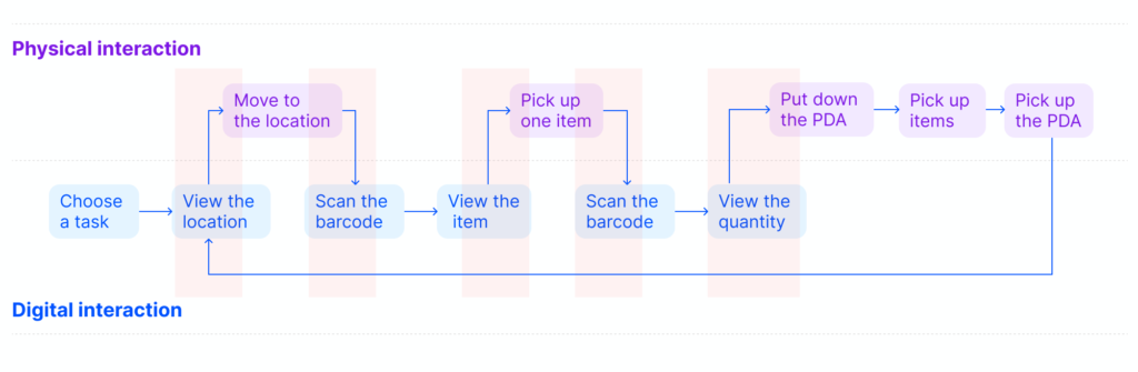
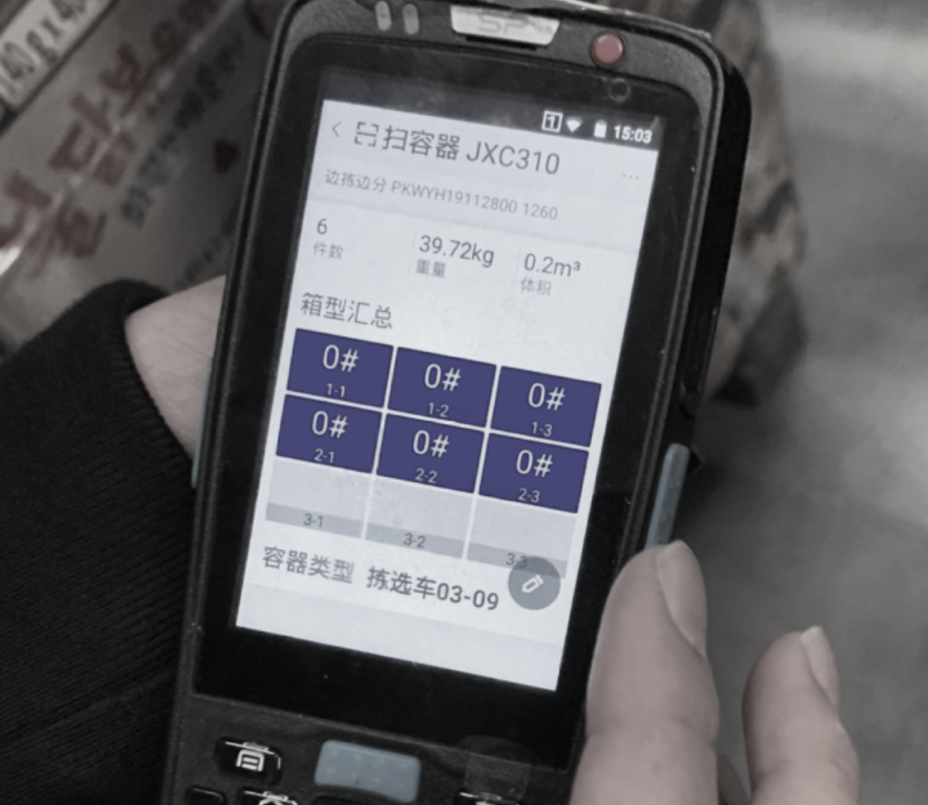
Personal digital assistants (PDAs) are smart terminals that help warehouse workers track and complete tasks by providing real-time information and barcode scanning. For instance, for an online order, a worker receives a picking task on the PDA, uses the PDA to locate items in the warehouse, then scans barcodes to verify identity and quantity.
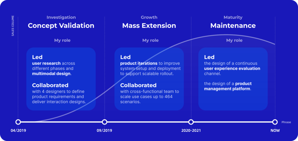
My role
The project spanned three years, with my role evolving from leading user research and multimodal design in the concept validation phase to driving the product ecosystem design as we scaled up.
Outcome
8.9%
Increased efficiency
464+
Scenarios
4.3/5
User satisfaction rate
Project Background
The need for intuitive and affordable PDAs
Company vision: enable the digitalization of logistics operations with PDAs
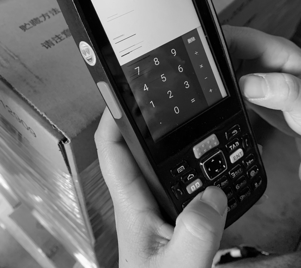
Challenges with current PDAs:
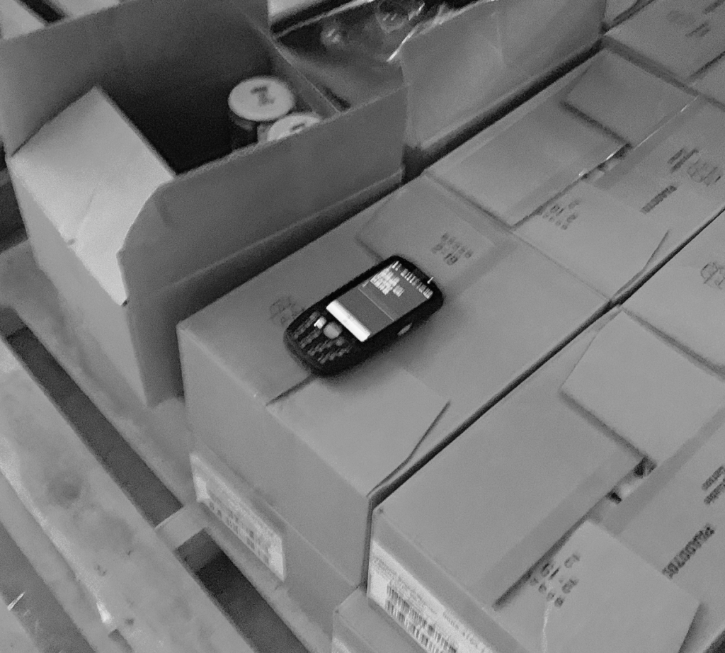
Poor ergonomics
Weighs 300-500g and unsuitable for long-term use.
Hard to learn
Has redundant functions and overly complex button layouts.
High cost
Costs $150-$300 per unit.
Project goal
Redesign the PDA as a cost-effective and lightweight ergonomic device for ease of learning and use.
Project constraint
Keep the production cost under $15 per unit within 5 months.
User Research
Where do users experience friction when using current PDAs?
I leveraged three user research approaches to understand the use and pain points of current PDAs: (1) shadowing workers, (2) contextual interviews, and (3) first-person testing.
Through workflow analysis, I found that workers constantly switch between interacting with the physical environment (e.g., moving) and the digital device (e.g., scanning).
Frequent and disruptive transitions between physical and digital interactions break workers’ task flow, caused by three pain points.
An overload of physical buttons increases learning difficulty and reduces operational efficiency.
The large and heavy form requires users to frequently pick up and put down the device while handling items.
Excessive information density forces users to squint to move closer to the screen mid-task.
Design Challenge 1
Balance portability and lightweight design with complex operational needs
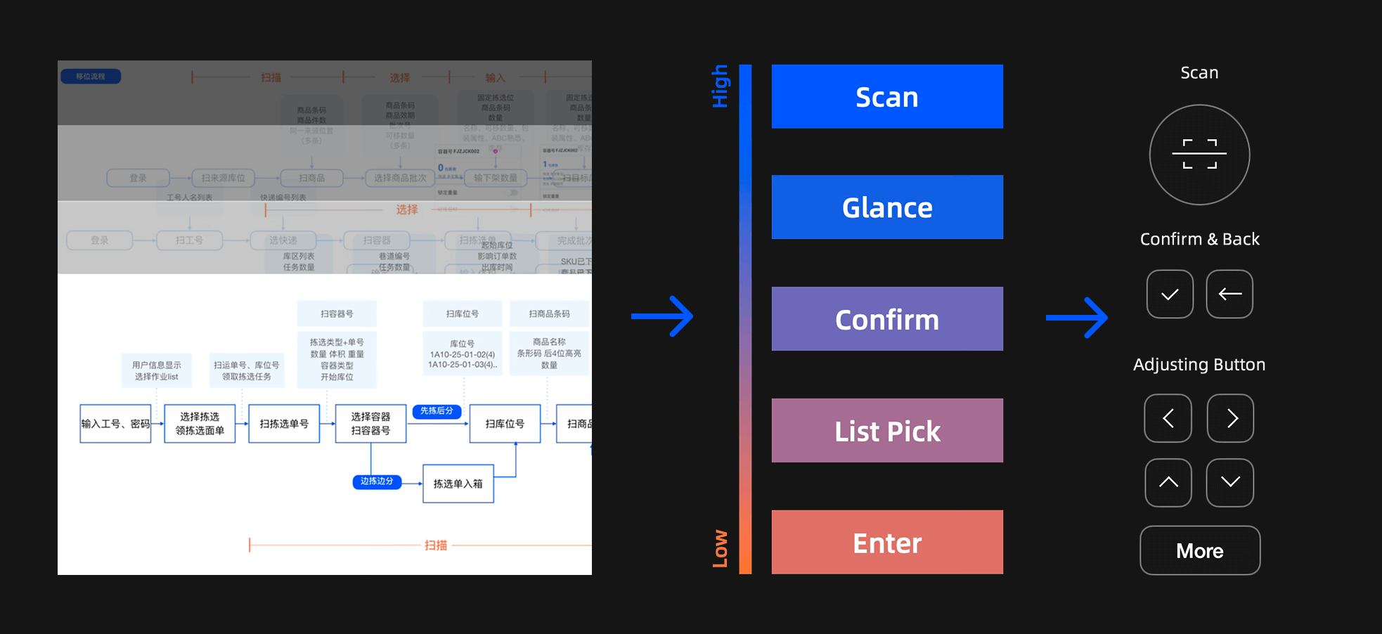
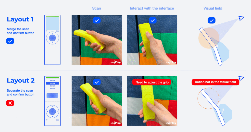
01 I analyzed 84 scenarios to rank the frequency of actions in the workflow to identify the minimal viable set of buttons required to support core actions.
02 Mapping the button layout to the interaction frequency, I collaborated with our industrial designer to carry out expert heuristics on layout alternatives.
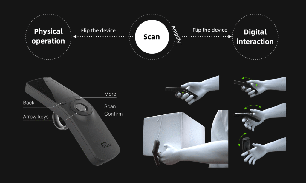
03 The final layout was selected as it placed the most frequently used buttons within a natural grip zone and reduced the button set, improving the learnability and glanceable
Design Challenge 2
Minimize the visual workload without sacrificing critical information.
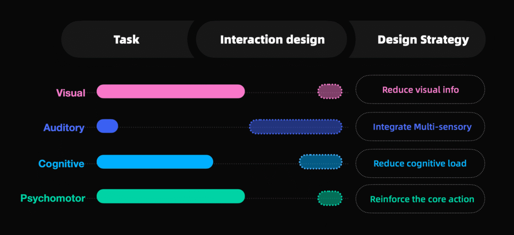
Analyzing the warehouse picking process using the VACP model (Visual, Auditory, Cognitive, Psychomotor), we found that the visual and psychomotor channels were heavily taxed.
Strategy 1: Design for glanceability
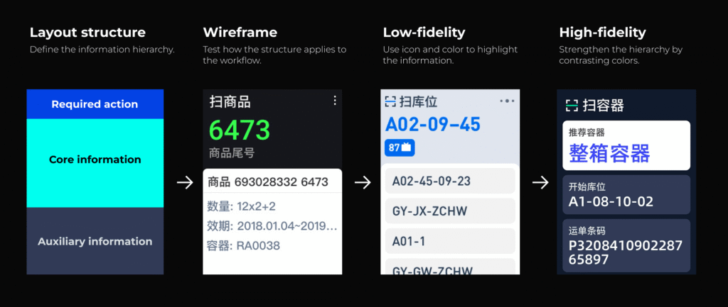
Task analysis showed that each workflow step has one action and one primary piece of information, supported by auxiliary details.
Working with 2 UX designers, we:
Restructured the information hierarchy to foreground the key action and information.
Explored and iterated multiple layout concepts with varied visual cues, evaluating them through expert heuristics and user testing.
Selected a high-contrast layout that allows users to grasp critical information at a glance.
Strategy 2: Reduce visual workload by multimodal design
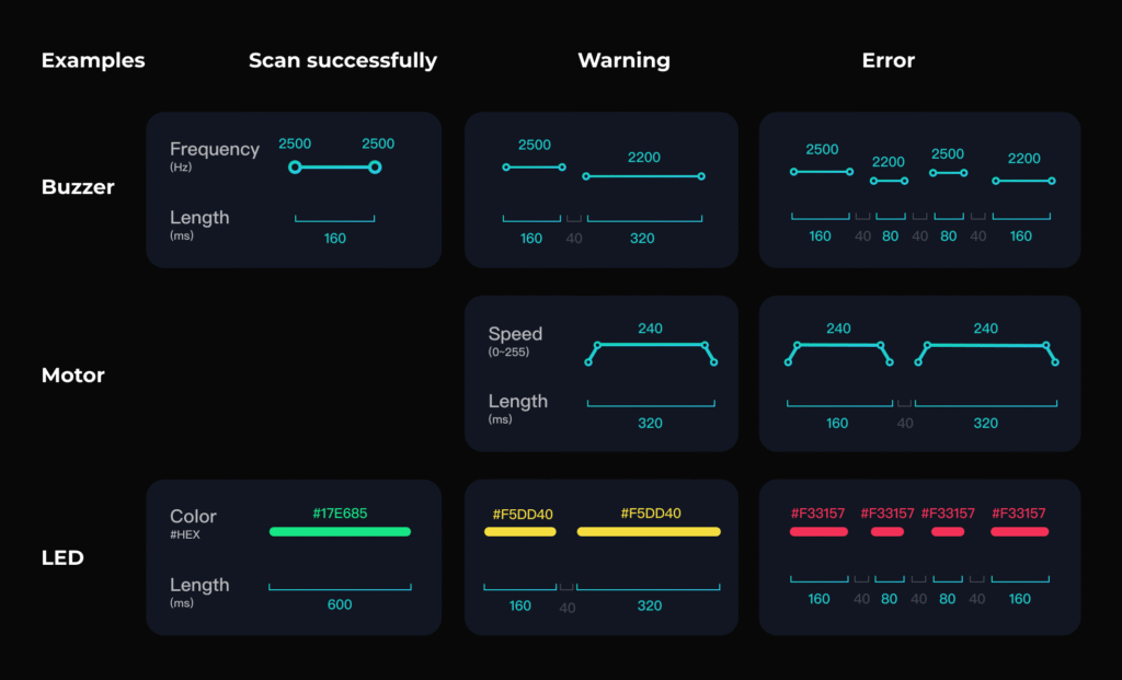
To further reduce visual workload, we redistributed feedback across multiple modalities. I:
Catalogued and ranked all system feedback states based on criticality and complexity.
Mapped each state to visual, auditory, and haptic modalities according to required urgency and modality appropriateness.
Designed and selected sound effects by conducting experiments to assess their valence and understandability in warehouse contexts.
Design Challenge 3
Balancing manufacturing speed with design validation
This project operated under aggressive mass-production timelines, creating tension between the need to rigorously rationalize design decisions and the pressure to meet manufacturing milestones.
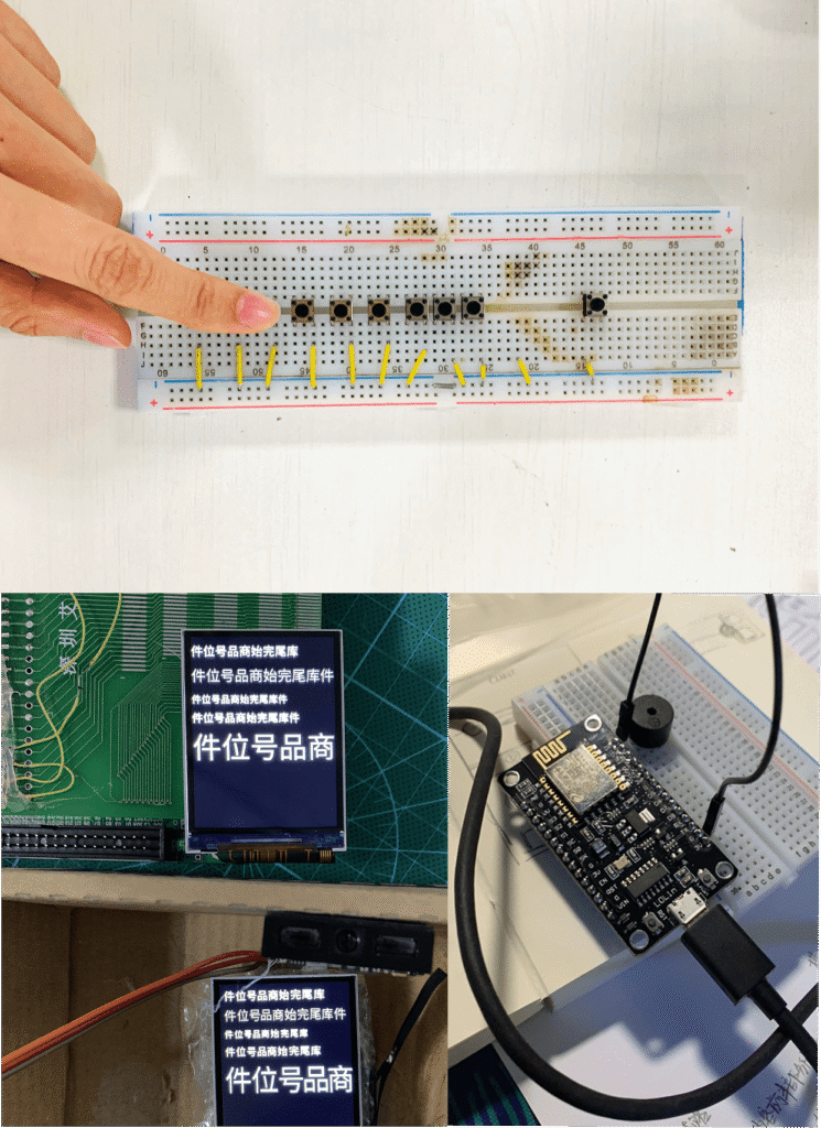
My approach: build to think
Built targeted physical prototypes using Arduino to rapidly evaluate visual, auditory, and haptic concepts.
Integrated and tested sound cues and UI behaviors on engineering sample devices, avoiding duplicate development efforts.
MVP Evaluation
Findings: Easy to learn with increased operational efficiency
We validated the production-ready devices during peak season operations by deploying them to 30 warehouse workers over two days. I led the research design, data collection, and data analysis, evaluating the operational efficiency and user experience from both quantitative and qualitative approaches under real pressure.
Quantitative evaluation
– Compared operational efficiency (items picked per hour) between redesigned and legacy PDAs using descriptive statistics and one-way ANOVA.
– Collected structured Likert-scale responses measuring learnability, clarity of information, and multimodal feedback, as well as perceived portability and comfort.
Qualitative evaluation
– Conducted contextual interviews on-site to uncover strengths, friction points, and improvement opportunities in real workflows.
Outcomes:
5.8%
Increased efficiency
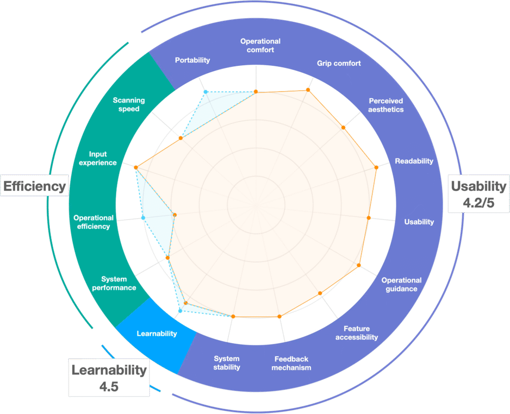
4.2/5
Learnability
4.2/5
Usability
“This tiny PDA is convenient to use, especially when carrying goods. I just need to flip it over, and I can move boxes.”
“I just need to scan, no need to read a lot.”
Scale-Up Strategies
Toward designing a service ecosystem
As the product moved into mass production and deployment, our design strategy shifted from optimizing operational experience for warehouse workers to designing a service ecosystem that sustains experience across a fleet. Two main challenges emerged:
For the R&D team 👩💻
How could we continuously monitor user experience in the field and drive data-driven iterations at scale?
For the warehouse manager 👩🏭
How could we effectively deploy, monitor, and manage devices?
Iteration 1
Building continuous user evaluation channel
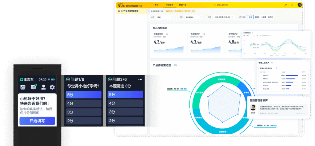
I drove the design and implementation of a feedback loop between users and the R&D team. Users receive monthly and post-release in-device questionnaires, providing quantitative insights on learnability, usability, and perceived efficiency. These insights are processed and visualized on a centralized platform, enabling continuous user experience monitoring and identifying target groups for deeper qualitative interviews.
18.1w responses received until 2021.
Iteration 2
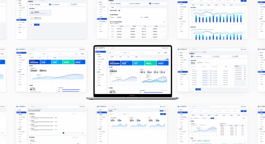
Designing device management system
I initiated the design of a device management system to support large-scale deployment and remote fleet management. The system enables warehouse managers to monitor device status and improve operational visibility.
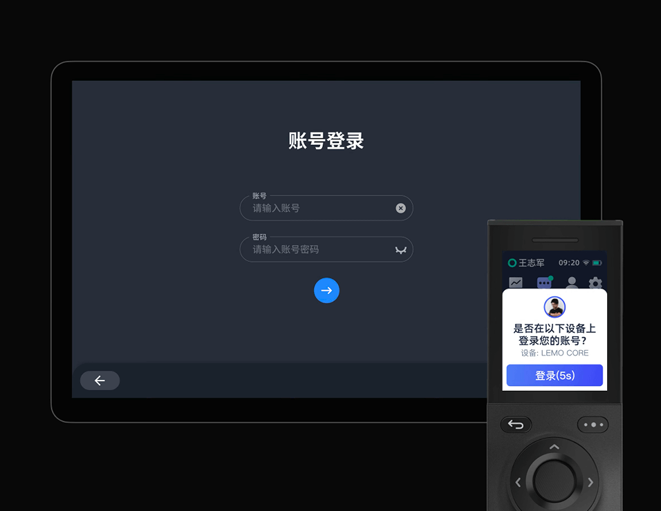
Iteration 3
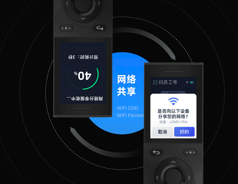
Leveraging device connectivity to provide a seamless cross-device experience
Streamline large-scale device setup by Bluetooth-based internet sharing, reducing the dependency on manual network configuration.
Enable PDA-based quick login to workstations, allowing workers to authenticate on shared computers via Bluetooth, speeding up shift transitions within the device ecosystem.